ShopDreamUp AI ArtDreamUp
Deviation Actions


Suggested Deviants


Suggested Collections


You Might Like…


Featured in Groups


Description
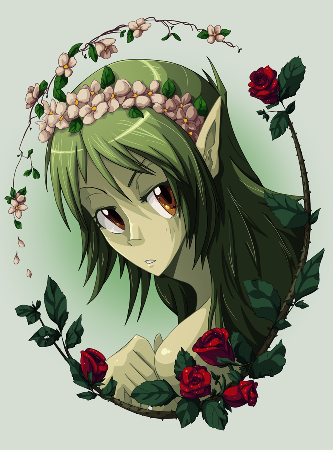
Something that I scribbled on paper while listening to the soundtrack for Ghibli's new movie, Karigurashi no Arrietty, particularly the first track, which I think is called The Neglected Garden. Anyway, I really liked the sketch and wanted to finish it up with colour and stuff. I am really really! proud of the silly flower frame thing, especially my roses. I didn't think I'd pull it off quite that well. xD I don't think I want to draw or colour a flower or leave for a while now.
Character is Apple-Pop, my eniripsa in the online game Dofus. Simply because one of the lines in the song mentions 'little fairies' and that's what she is. : D
-------------------------------------------------------------------
Eniripsa design belongs to Ankama. But Apple-Pop is mine! Sorta...
Character is Apple-Pop, my eniripsa in the online game Dofus. Simply because one of the lines in the song mentions 'little fairies' and that's what she is. : D
-------------------------------------------------------------------
Eniripsa design belongs to Ankama. But Apple-Pop is mine! Sorta...
Image size
667x900px 513.32 KB
© 2011 - 2024 Makio-Kuta
Comments34
Join the community to add your comment. Already a deviant? Log In
This picture immediately jumped off the page at me, and by jumped off the page I mean tackled my unsuspecting eyes with pretties of a calibre that they were not expecting. Your colouring job here is absolutely spectacular. The colours are all tinted to give the picture a united feeling while the cel-shading really makes her jump out. The coloured lineart really adds a nice touch, giving the picture a softer fell while maintaining the crisp look that the cel-shading gives it.
The face and neck seem a bit off to me. Her eyes in particular seem overly big- I have a hard time picturing her eyes completely open and not looking a bit awkward on her face. The angle/shape of her right eye seems tilted a bit too much counterclockwise (I think that makes a left tilt - too much like \ ) Her neck also seems too thick, looking over her shoulder, the chin should stick out more before the neck descends. The chin seems a bit shallow too, but that may be due to the really big eyes coming down so far on her face. I really like her hand and ear though - the pose for the hand looks very natural.
My favourite part of this picture, okay I have two but I will start with the lighting. You did an amazing job with the lighting and all of the colours blend down evenly and add to the overall unity and beauty this picture has.
But my absolute favourite aspect is the flowers and your border. The detail in the flower crown is wonderful and the border is incredible. The bright red of the roses stand out against the green hues of the picture and the contrast immediately catches (and pleases) the eyes. Making the leaves a different green hue was a good choice as it sets the border apart from the picture and keeps them from getting lost in the greens of her hair. The skinnier border on top that matches the crown creates a nice balance with the roses by being off-balance (if that makes any sense). The picture becomes a bit heavier on the lower right which here works wonderfully, especially given the angle of the lighting. the vines do an incredible job of containing the picture without closing it in completely. Your art has really come a long way in a short time, I eagerly look forward to seeing where it will continue to go~
Summary: Incredible colouring and detail overshadow a couple small facial anatomy issues. Beautiful border compliments picture perfectly ~ a piece you should rightfully be very very proud of.